- 16 Jul 10, 20:32#207467
I know this has probably been a topic that has always cropped up somehow but I just want your opinions on this matter and for me to share my own.
Right let's start:
McLaren: I like the look of it and looks fantastic when in motion but I wish they would go back to the Senna and Prost days with the white and red colour scheme. Albeit without the iconic marlboro sponsorship for legal reasons and regulations but Mercedes were always the silver arrows and they are back now. I'm not really a fan of the fin but it's there for a reason of course, at least it doesen't look as bad as some other cars.
Ferrari: Back to basic it seems and I like it but needs some iconic sponsoring to beat the f2002 in my mind. I am however glad that the rear fin does not exist for I think it would ruin the car's profile.
Red Bull: The best red bull racer we've seen and one of the only cars that looks good with the rear fin, probably because of the navy blue paint. I just love the bold decals and colours on this car, one of the best.
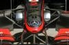
Mercedes: I love the profile of this car and glad that they are in their traditional colours. I would like it even more if it had less sponsor decals, like the version that was first seen in pre season testing.
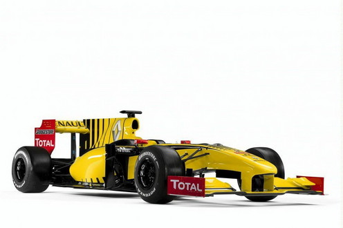
Renault: This car is to be marveled at with it's wasp like colour scheme which reminds me of past Jordans which is a blast from the past. It's agressive paint job makes up for the mediocre designs of 2007 - 2009.
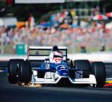
Williams: I love the shape of the body of this year's williams but I think the blue is a bit too light and should be a tad darker like the former fw 25.
Force India: Simple design but very effective and looks great in motion and i like the 'Kingfisher' font on the rear spoiler.
Sauber: Now I know Sauber are now strictly separated from BMW now but this for me is too plain and does not look too great but the body is very aggressive and imposing so let's hope next year they have a better paint scheme. And please ditch the Burger King sponsor! My brother laughs at it every time he sees it and I really don't like those wheels either. In my mind the worst looking car on the grid.
Toro Rosso: I think the more aggresive bull of toro rosso makes it look faster at speed but I can't help thinking they've overdone it just a bit too much.
Lotus: Absolutley love the british racing green paint and the trademark lotus gold wheels in there as well! Best looking car on the grid in my mind.
Virgin: I was not really a fan of the virgin car at first but now it seems to be growing on me and I like it much more than I did.
Hispania: Bland and dull is all I have to say, no real paint job or sponsors either. It's good I guess that they are the bottom team so the car does not get seen much during the race unless it crashes again.
Please do let yourself heard!
Thanks, Matt
Right let's start:
McLaren: I like the look of it and looks fantastic when in motion but I wish they would go back to the Senna and Prost days with the white and red colour scheme. Albeit without the iconic marlboro sponsorship for legal reasons and regulations but Mercedes were always the silver arrows and they are back now. I'm not really a fan of the fin but it's there for a reason of course, at least it doesen't look as bad as some other cars.
Ferrari: Back to basic it seems and I like it but needs some iconic sponsoring to beat the f2002 in my mind. I am however glad that the rear fin does not exist for I think it would ruin the car's profile.
Red Bull: The best red bull racer we've seen and one of the only cars that looks good with the rear fin, probably because of the navy blue paint. I just love the bold decals and colours on this car, one of the best.
Mercedes: I love the profile of this car and glad that they are in their traditional colours. I would like it even more if it had less sponsor decals, like the version that was first seen in pre season testing.
Renault: This car is to be marveled at with it's wasp like colour scheme which reminds me of past Jordans which is a blast from the past. It's agressive paint job makes up for the mediocre designs of 2007 - 2009.
Williams: I love the shape of the body of this year's williams but I think the blue is a bit too light and should be a tad darker like the former fw 25.
Force India: Simple design but very effective and looks great in motion and i like the 'Kingfisher' font on the rear spoiler.
Sauber: Now I know Sauber are now strictly separated from BMW now but this for me is too plain and does not look too great but the body is very aggressive and imposing so let's hope next year they have a better paint scheme. And please ditch the Burger King sponsor! My brother laughs at it every time he sees it and I really don't like those wheels either. In my mind the worst looking car on the grid.
Toro Rosso: I think the more aggresive bull of toro rosso makes it look faster at speed but I can't help thinking they've overdone it just a bit too much.
Lotus: Absolutley love the british racing green paint and the trademark lotus gold wheels in there as well! Best looking car on the grid in my mind.
Virgin: I was not really a fan of the virgin car at first but now it seems to be growing on me and I like it much more than I did.
Hispania: Bland and dull is all I have to say, no real paint job or sponsors either. It's good I guess that they are the bottom team so the car does not get seen much during the race unless it crashes again.
Please do let yourself heard!
Thanks, Matt
'I don't drink but I love to end a weekend smelling of champagne'