- 25 Jan 10, 07:59#181390
The Williams does not look too bad to be fair. But the Virgin car does look pretty awesome 
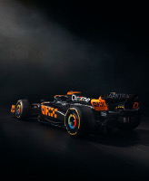
I still think McLaren will have the best looker
I still think McLaren will have the best looker
ライブ、平和のうちに生存する。 
Over a dozen reusable components built to provide iconography, dropdowns, input groups, navigation, alerts, and much more...


It's not the RB01, it's the BGP01 in 2010 livery...but anyway.. nice livery, doesn't look chrome to me....


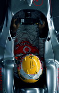
not really a fan of the black highlight on the mercedes logo on the engine cover. its just floating and lacks purpose.
the car itself looks nice.
 An opinion I agree with. The black logo looks misplaced but the rest of the car is good.
We have created lots of YouTube videos just so you can achieve [...]
The best flat phpBB theme around. Period. Fine craftmanship and [...]
All you need is right here. Content tag, SEO, listing, Pizza and spaghetti [...]
this should be fantastic. but what about links,images, bbcodes etc etc? [...]
Swap-in out addons, use only what you really need!