What about the drivers? What have they got to say on the subject?
wrote:">
Drivers not keen on new F1 logoAbu Dhabi - Top F1 drivers have reacted coolly to the unveiling of the sport's new logo.
Although the full F1 rebranding won't be launched until the start of next season, the world got a peek at the new logo on the podium of the 2017 finale in Abu Dhabi.
F1 commercial boss Sean Bratches is quoted by La Gazzetta dello Sport: "We wanted to present it now in order to help our partners look into how they will use it."
But Sebastian Vettel, referring to the iconic 'flying 1' logo that was introduced in the Bernie Ecclestone era in 1993, said: "I liked the old one better."
Liberty Media's new F1 trademark is a stylised F and 1, similar to the red Espn logo.
Igor Yermilin, a Russian motor racing official, told Sportbox: "It feels like the new owners want to prove themselves by abandoning what was done before,"
"But the new logo is incomprehensible, uninteresting, cheap and primitive."
Abu Dhabi winner Valtteri Bottas added: "What was wrong with the old one?"
And world champion Lewis Hamilton said: "I think the one we had already was iconic. Just imagine Ferrari or Mercedes changing their logos."
A clearer logo
F1 commercial boss Sean Bratches explains: "Many people never realised that there was an invisible 1 between the F and the 1 in the old logo. The new logo is clearer.
"It was also difficult to embroider the impression of speed in the old logo on shirts, etc.
"In the digital era, big brands like Starbucks and Coca-Cola have simplified their logos for clarity, and that's the case for us as well."
As for the criticism, Bratches said: "Every time a brand is changed, and especially a brand that arouses so much passion, you have to expect these reactions.
"It's normal that people do not like change, but I think that's good because it shows that people care about the brand," he added.
FIA president Jean Todt said the sport's governing body approves of the new logo.
"It's up to the rights holders to introduce a new logo if they want to," he said in Abu Dhabi.
"People should be positive about change. The people at Liberty are very talented and have proven their qualities in other sports. I trust their judgement."

 After the agony of defeat, success will be sweet!
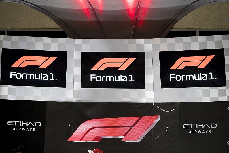
 fan input: https://www.autosport.com/f1/news/13329 ... ew-f1-logo